Case Study: Salton Appliances
Update the brand's previous packaging to a cleaner, more contemporary image
The Challenge
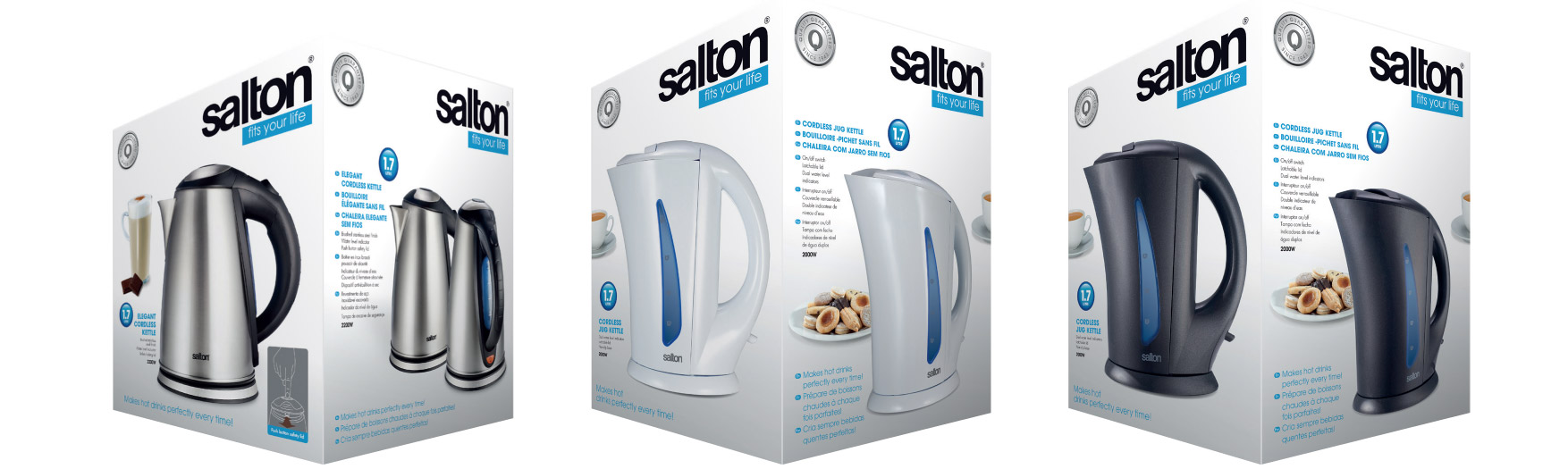
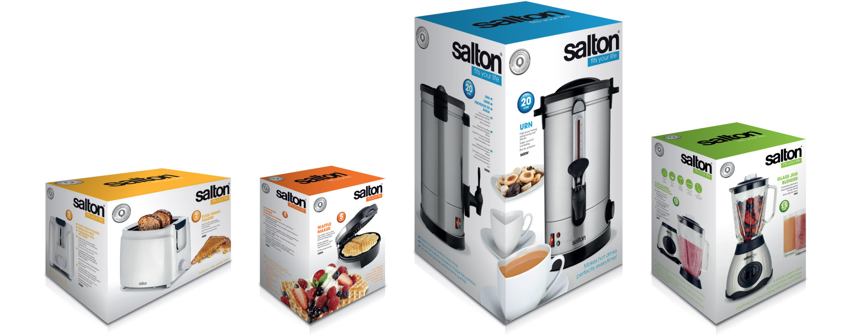
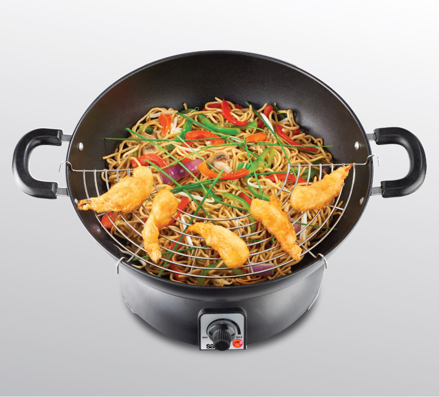
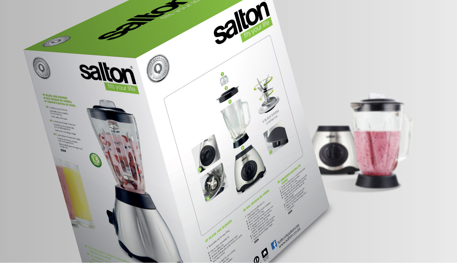
To retain an element of an established brand while creating a stronger impact on shelf. As consumers have a wide variety of products to choose from it is very important for brands to highlight the features and benefits of their products to help the consumer to make their purchase choice. We decided to move from a black package to a predominantly white one, with some bold areas of colour. We also needed to add appetite-appeal images to increase the impact.
The Solution
A quality symbol was introduced to promote the trustworthiness of the brand and reflect its credibility. Every surface of the package was designed to work harder, by having different images and information on each face. This served to inform and educate consumers as well as reflect an holistic overview of the product. -“The silent salesman”. Category colours were introduced to help consumers navigate where each product category is placed on shelf. The new design has supported brand awareness and enhanced sales.




 122 Barkston, 2194